Introduction
The typeface of choice for this type specimen book is Helvetica. I am fascinated with the ubiquity of Helvetica and how it became a designers go-to font. The supporting graphic elements are derived from the typeface itself. The beauty of Helvetica is the geometric features and the negative space between letters — I wanted to emphasize that with the illustrations.
I studied Swiss design and color palettes before I started to design. I watched the movie titled "Helvetica" as well. I wanted to as much research as possible about the typeface to fully understand why it was created and how it affects the world, while honoring the Swiss aesthetic.
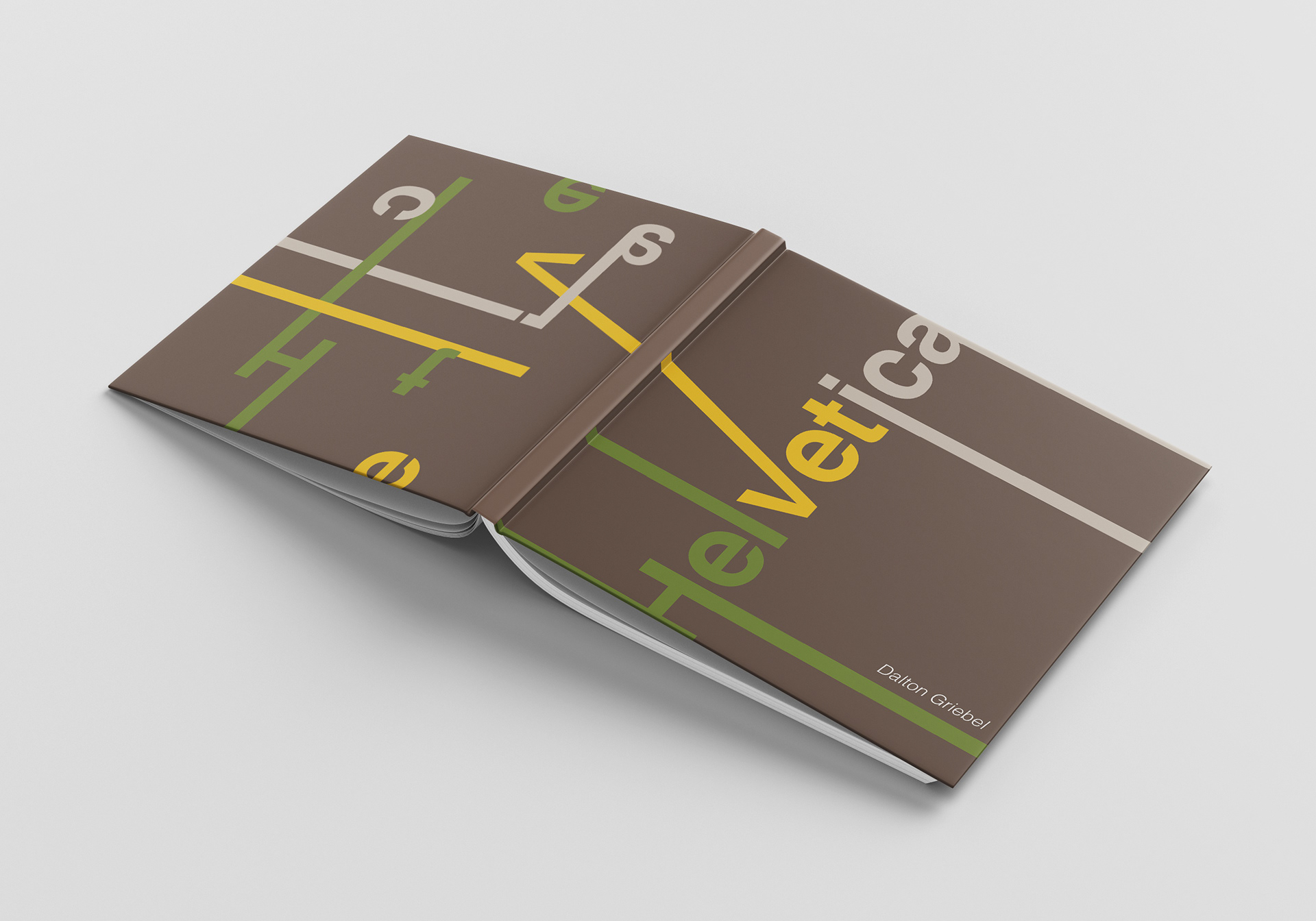
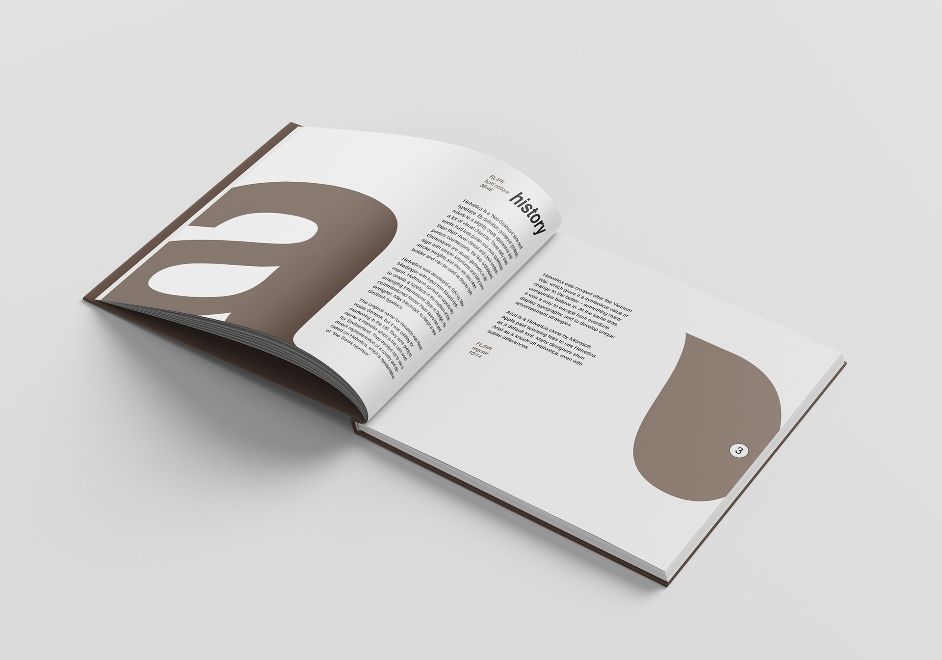
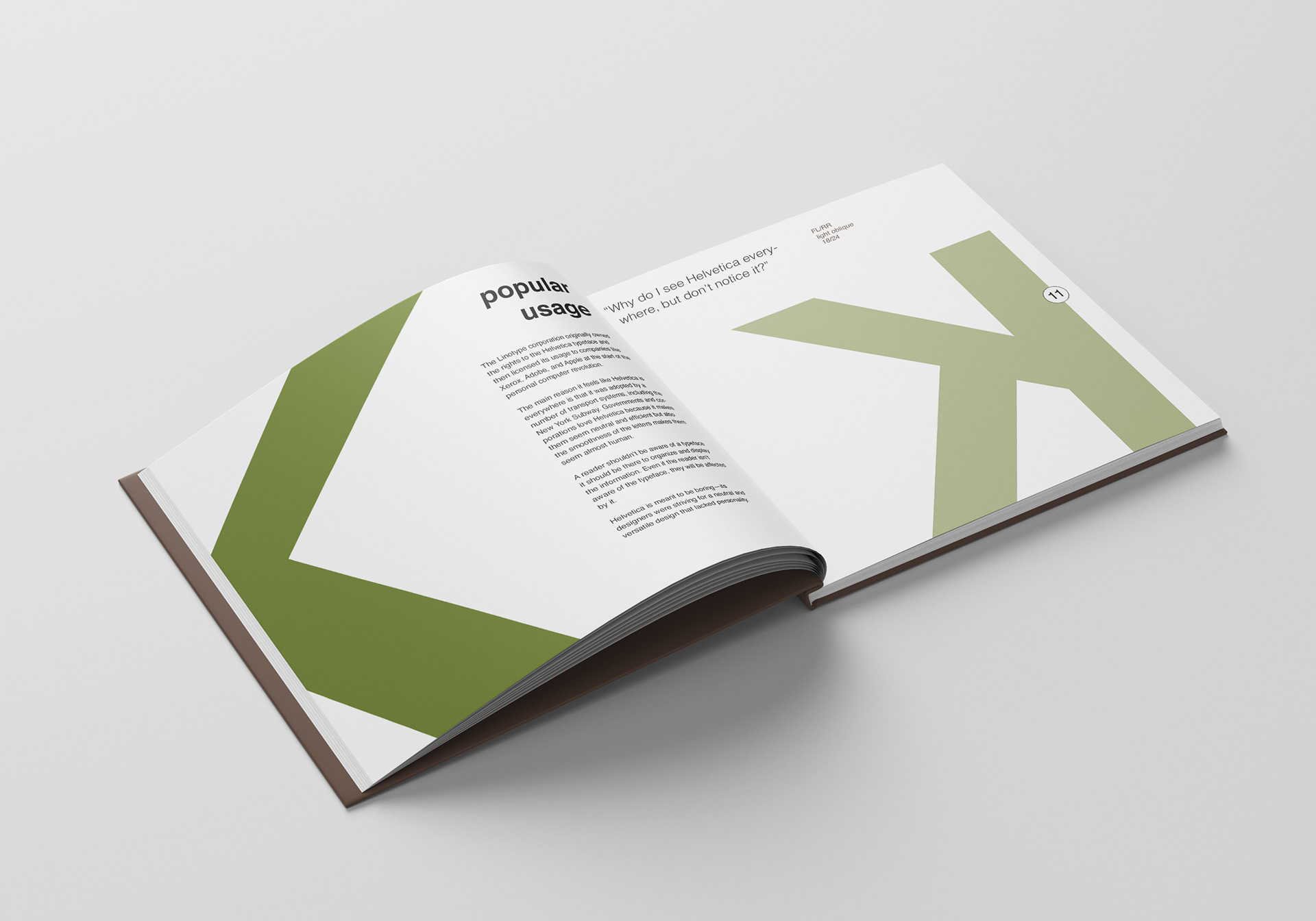
The color palette is inspired by midcentury Swiss colors. I wanted a light/dark neutral which is the tan/brown in this context. The yellow and green are analogous colors that work in juxtaposition to the earthy neutrals.
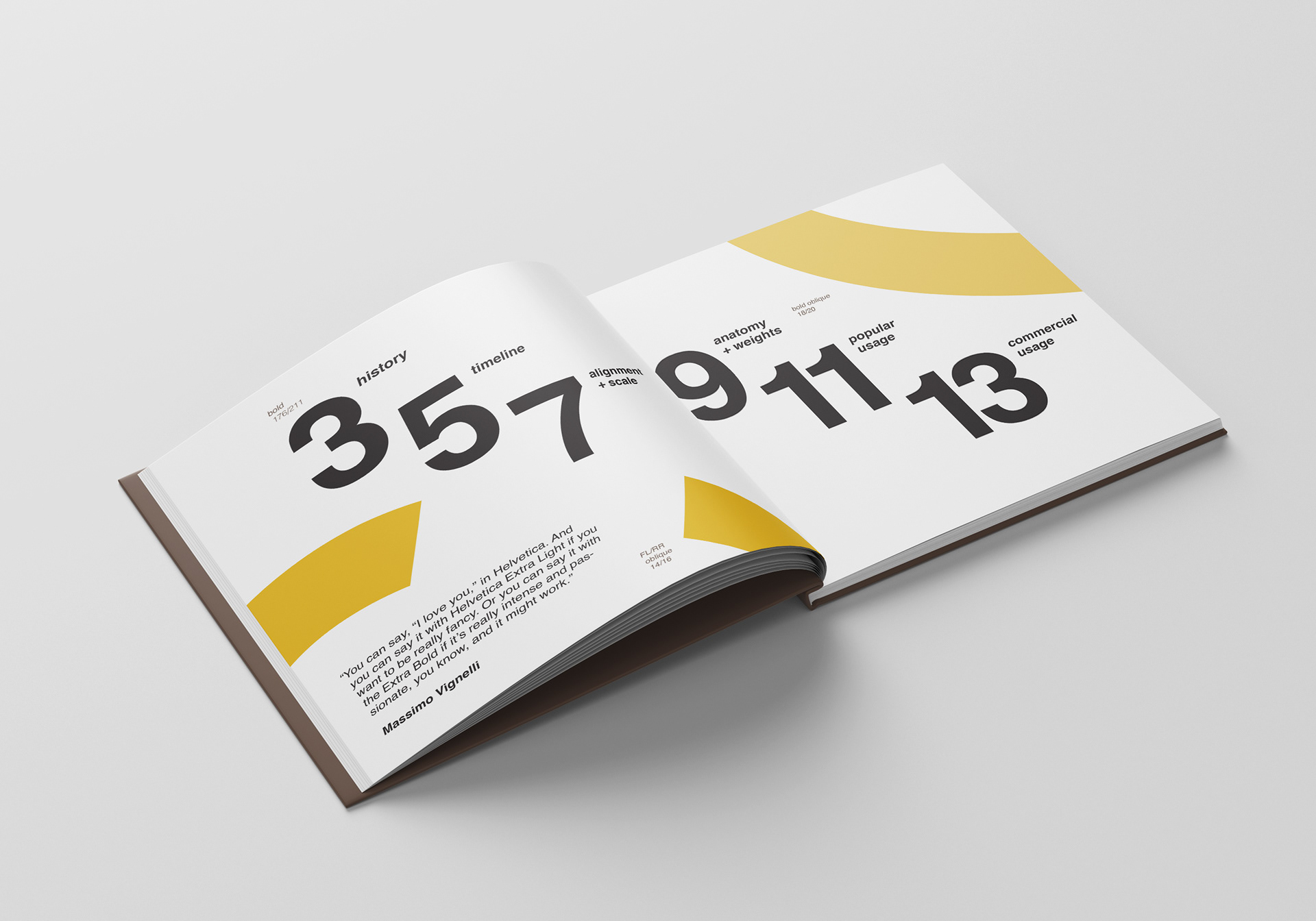
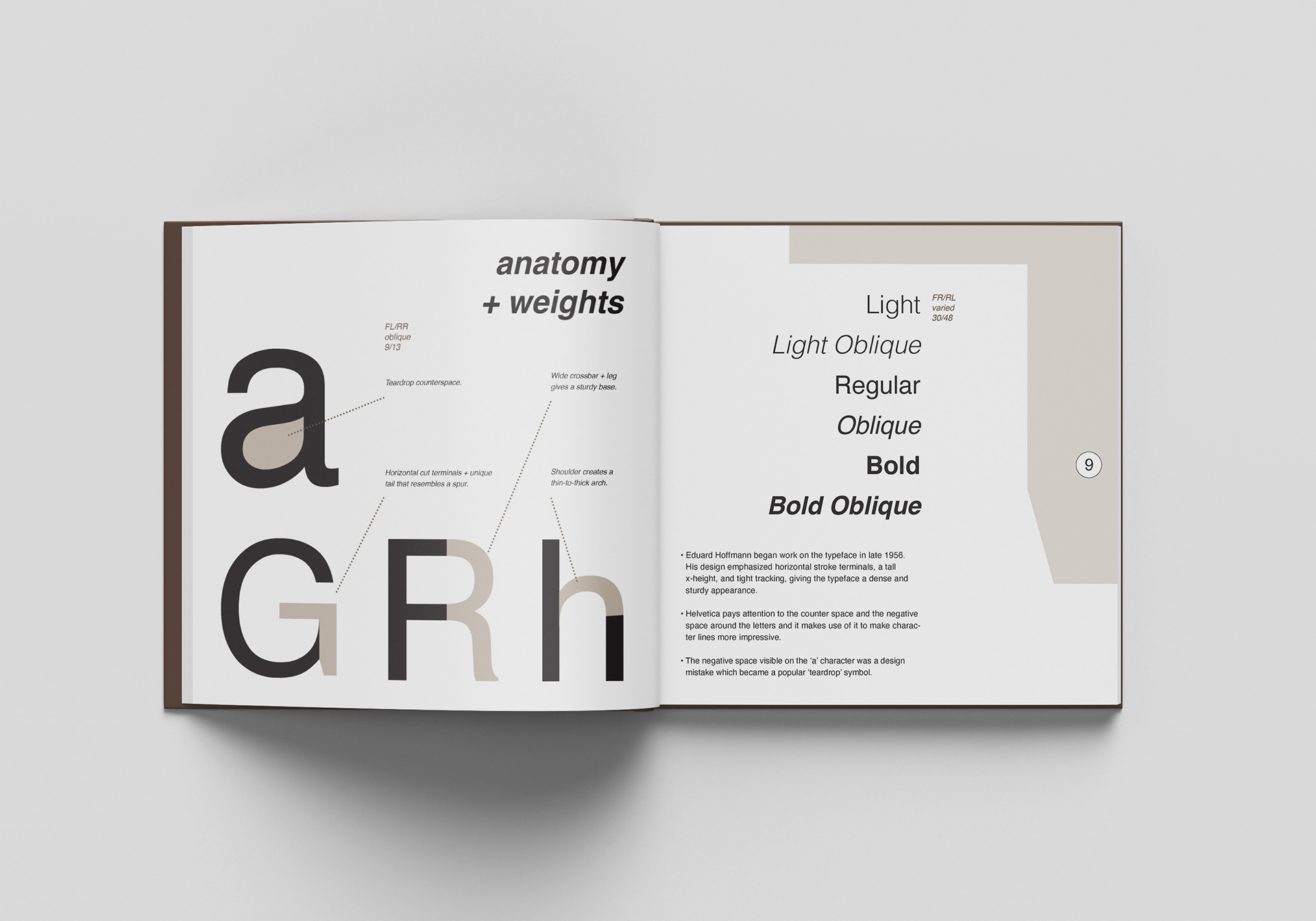
The geographic Sans Serif typeface, Helvetica, is widely considered the best typeface of all time. I used the gorgeous anatomy of the letters and scaled them up to show off its beauty. I added visual interest by bleeding the shapes off the page, which in turn created a more dynamic composition.