Introduction
This magazine was made based on my interest in music genre. I have always been intrigued by genre and the sort of repercussions of boxing artists in. In this assignment, I did research and featured articles that discussed different viewpoints of genre.
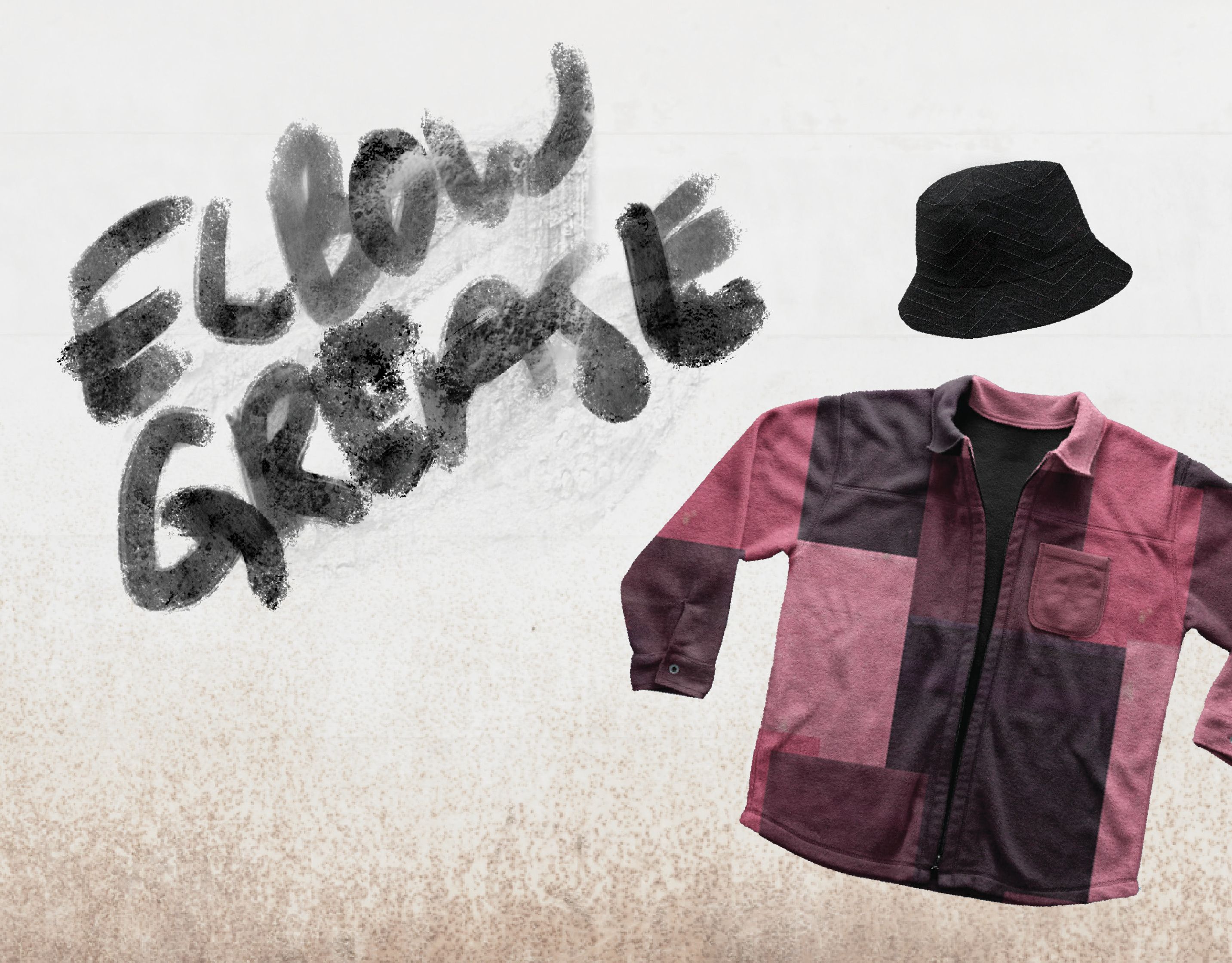
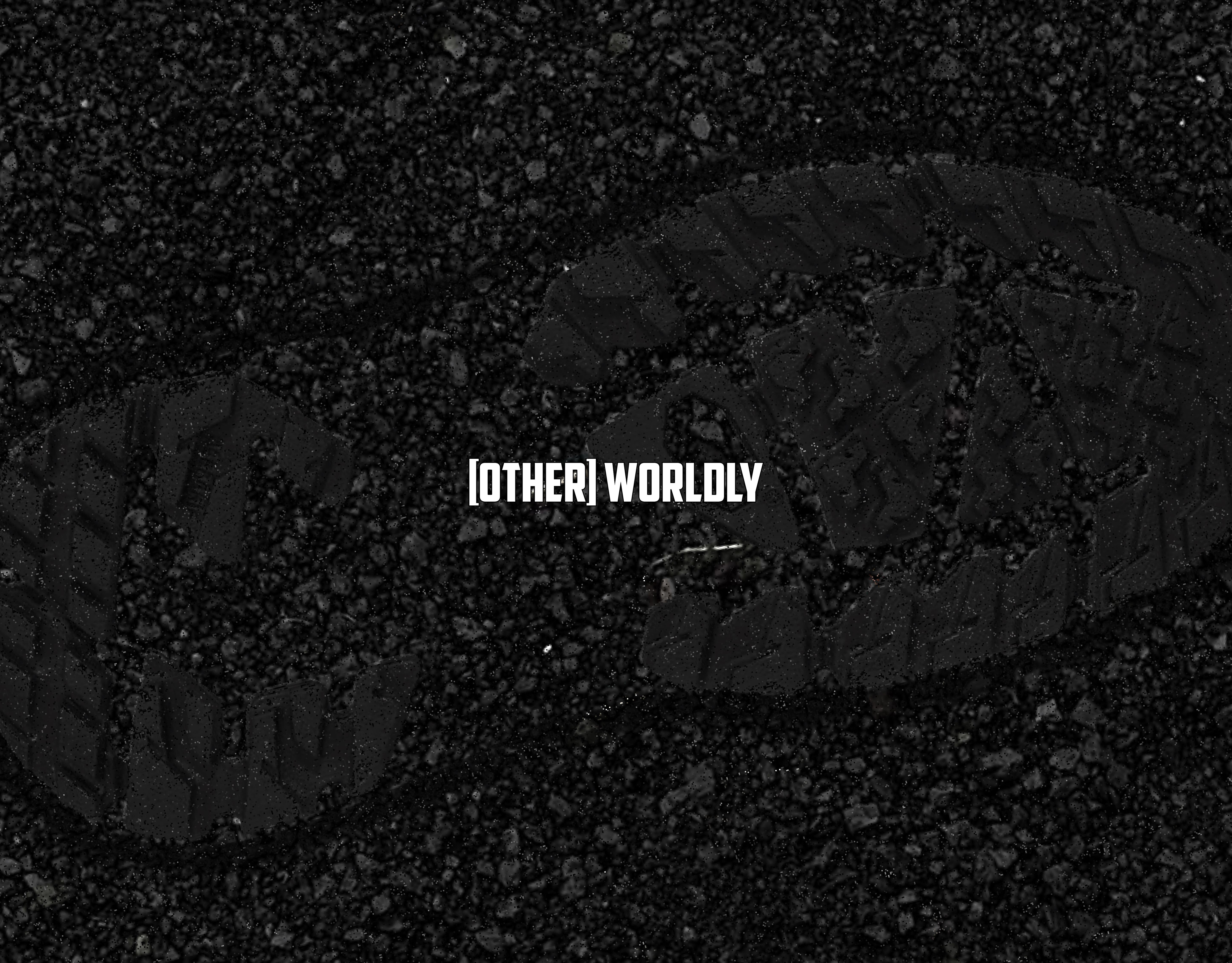
I challenged myself with expressive typography in this magazine. At this point I started to understand all the rules of type and wanted to bend them. I played with offsetting type, hierarchy, typesetting body copy, and image/text interactions. The concept of the magazine is artists that go against norms, so I wanted to make sure I did the same with my typography.
Experimenting
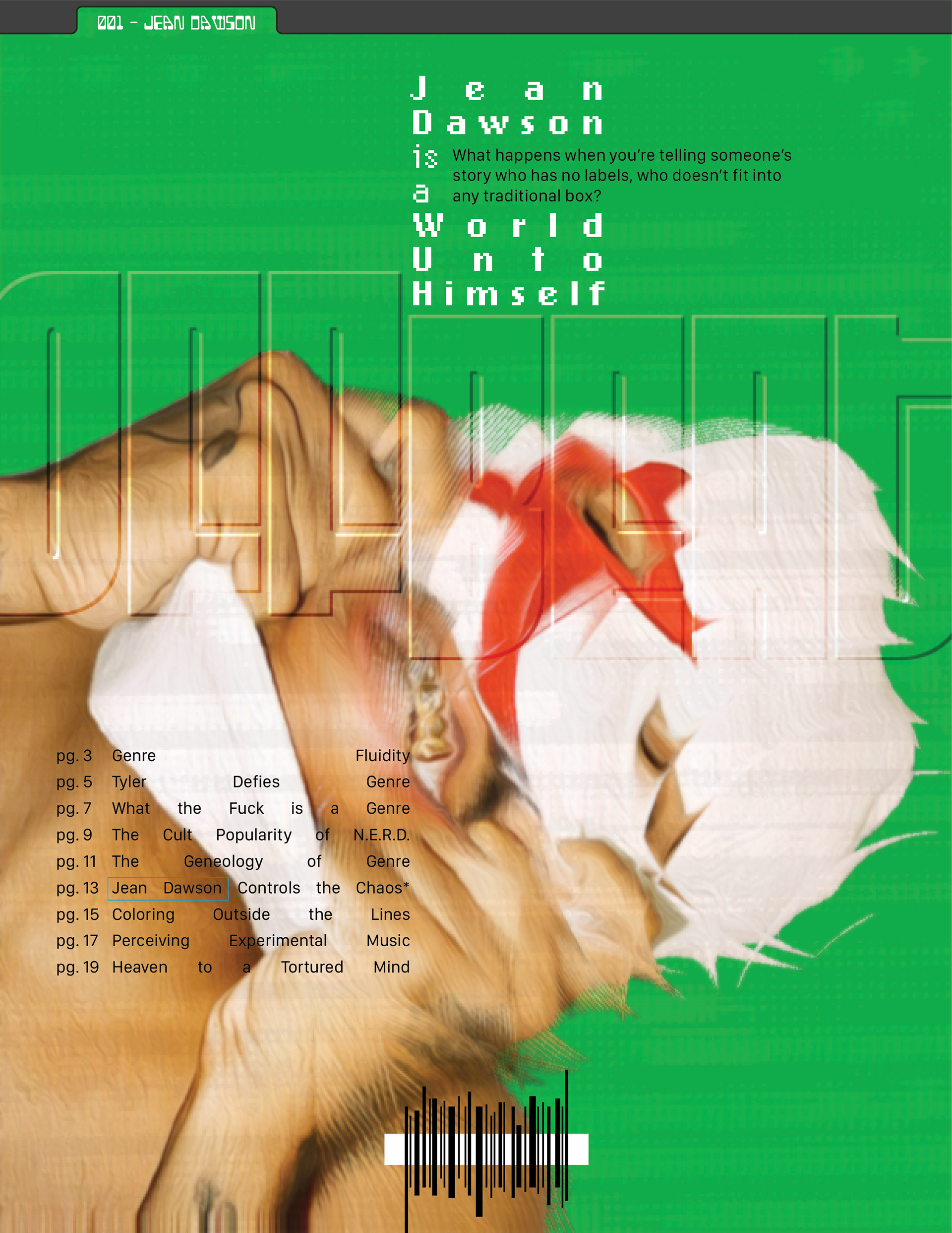
A table of contents on the cover? Why not.
I questioned the strict layouts of editorial design. There's always the cover, then the inside cover with table of contents, then the content of the book, etc. Even though having the table of contents on the cover seems unnecessary, I think it makes more sense in terms of being able to reference it instead of flipping to the first few pages to find it.
I experimented with using sound to alter design. I used one of Jean Dawson's songs "Green Screen" in an audio visualizer, saved a frame from the visualizer, made it black/white, and then used it as a displacement map on the portrait of him. It was exciting and fun to think of a way to visualize sound and make it more tangible.
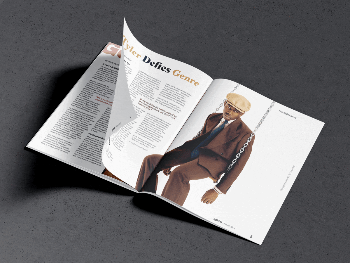
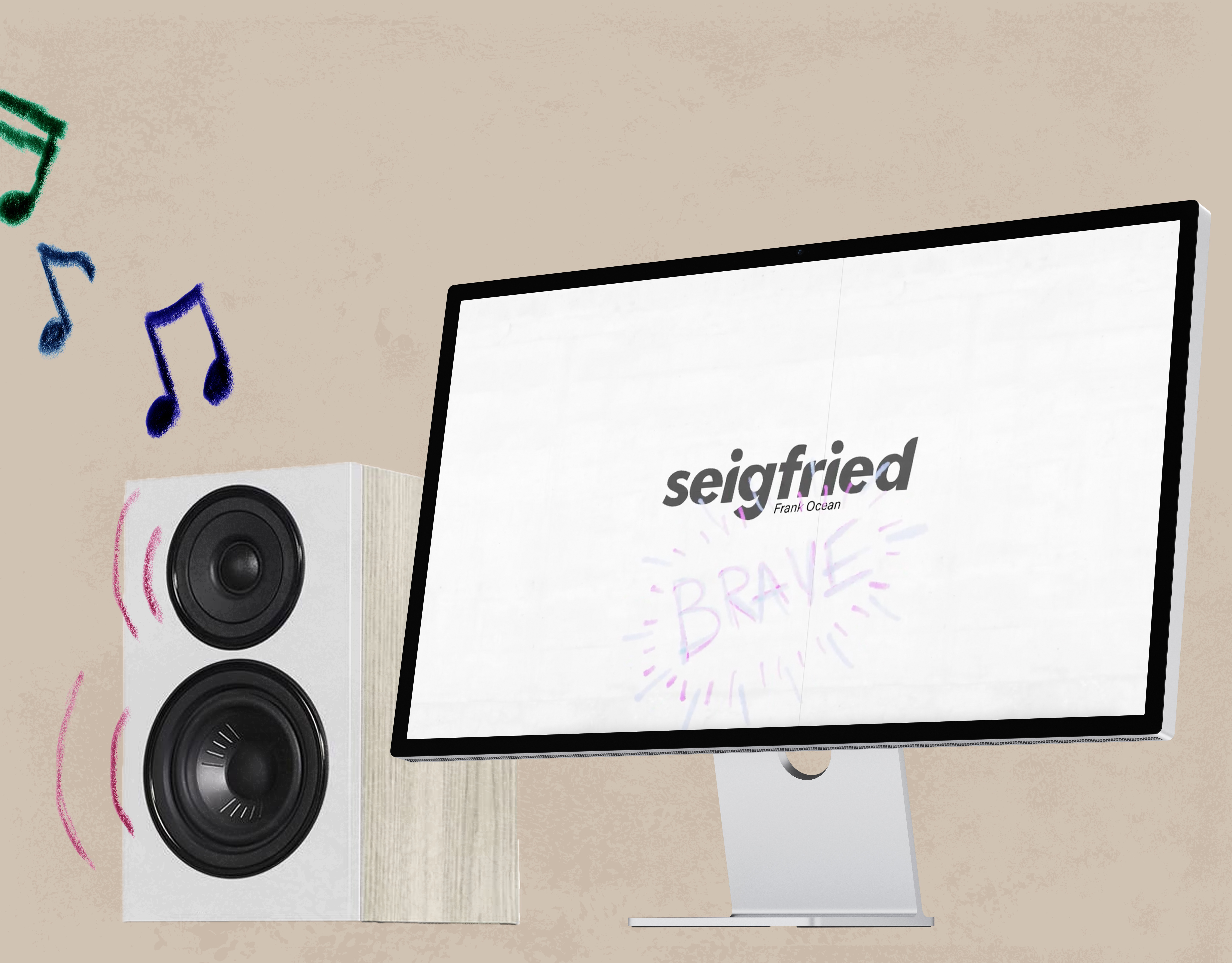
As far as design in the magazine itself, I wanted to show my versatility with type. I created spreads with infographics, iconography, playful imagery using type/image interaction, different font pairings, and creative use of photography.
offBEAT reflects my relationship with music and my curiosity with experimentation.